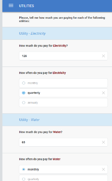
A plain mode roster is a presentation of the roster without buttons leading to a deeper level, but rather showing all the roster questions repeated in the same scrollable area. This is especially convenient when there are only a handful of questions in the roster, such as price-quantity-unit for many items, and going behind the button and back is very time consuming for the interviewers.
In the example below a roster of expenditures on utilities containing questions on the amount and frequency for each utility consumed is presented in plain mode.

We designate the roster to be shown in plain mode simply by checking the corresponding checkbox ‘Plain mode’ in the Designer.
A roster may be presented in the plain view only if it doesn’t have any rosters nested into it, and contains a limited number of child elements (questions, static texts, subsections). Elements made invisible with enabling conditions are still counted towards this limit. See the limits page for the exact limit.
It is a good practice (though not mandatory) to place a roster in a subsection, so that all of the roster items are isolated from any other fields in the questionnaire. In the above example, we may place the roster in a subsection “Utilities expenditures”.
